
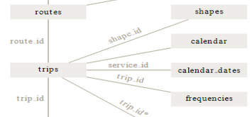
While embedded at MDOT MTA’s Office of Service Development in Baltimore, I created a series of dashboards that visualize static GTFS data in Tableau for easier QA/QC and analysis. GTFS feeds are composed of a series of text files in an open-source format, meaning that every transit agency that makes its GTFS feed public is making its schedule data available in a standard format. After processing the GTFS feed using Microsoft Excel, Microsoft Access, or R, the processed data can be displayed in Tableau. Dashboards created for MDOT MTA included a layover evaluation tool, block chart, stringlines (Marey diagram), headway by stop, blocks by route, buses per route per hour, and span per route.
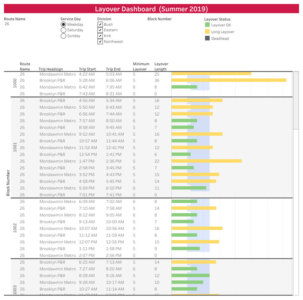
(Click to enlarge)
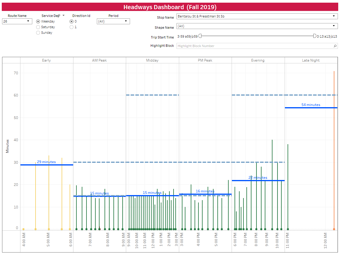
(Click to enlarge)
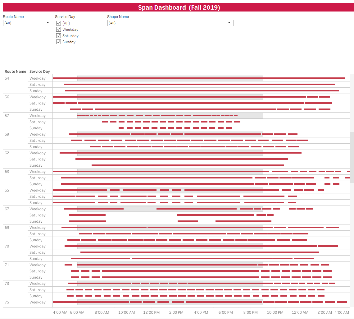
(Click to enlarge)